
Cucina Mezzo - Mandilag Project
Kitchen Upgrade in Pasig City, Focused on Storage, Layout, and Clean Execution
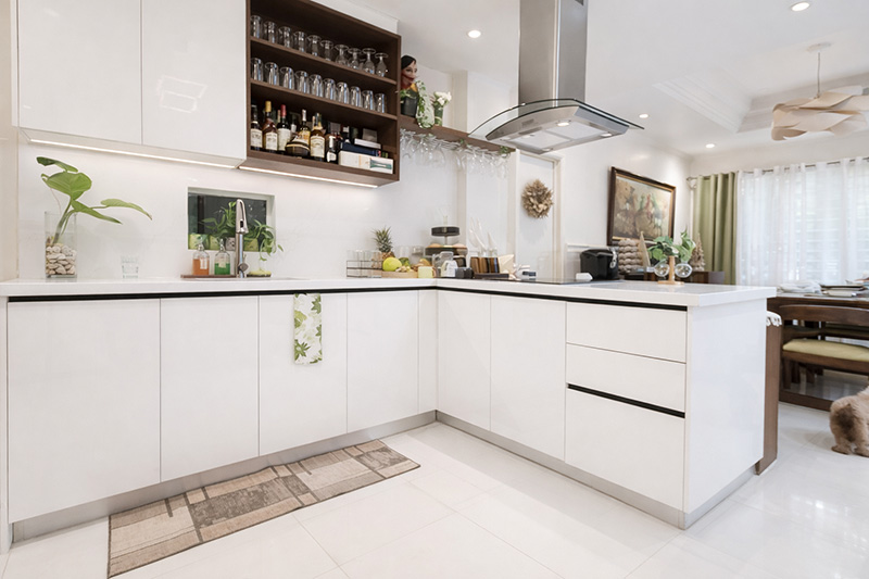
A kitchen upgrade isn’t just about replacing cabinets. It’s about removing daily friction—clutter that never clears, storage that doesn’t match real habits, and a layout that makes the space feel heavier than it should. The Mandilag Project in Pasig City was driven by exactly that need: make the kitchen more functional, more organized, and better to live in.
From the client-management side, this project required steady alignment on expectations, budget realities, and a fast-moving schedule. From the design side, the goal was to translate the plan into a built outcome with strong functional logic—appliance spacing, traffic flow, lighting, and premium detailing that looks and feels intentional.
Project Snapshot

Project Name:Catherine Mandilag Project
Location:Pasig City (House)
Area/Space:Kitchen
Trigger: Renovation
Client priorities (vs. price):
Sales/Account: Finish quality + Design look
Architect: Storage max (primary) + minimal disruption (install experience)
Rules/Constraints: No special rules noted
Privacy Note: Do not show address / exterior of the house
Approvals:2 revisions before approval
Schedule notes (as captured):
Must-start: in just 1 month
Must-finish: in 2 weeks of installation
Install duration also noted as about 1 week on-site
Challenge
The “before” condition had multiple pressure points coming from both existing conditions and constraints. From the sales/account notes, the kitchen had visible problems that affected daily experience: cabinets were submerged in flood, the carcass and doors were damaged, and lighting was poor. These are the kinds of issues that don’t stay “cosmetic”—they affect how the home functions.
From the architect’s perspective, the challenge also involved designing within limitations: working around an existing carpentry cabinet, pushing for more usable storage, and staying grounded to budget realities—while still producing a result that looks clean and works correctly day-to-day. The recurring symptom was daily friction: the kitchen felt cluttered and visually unpleasant, creating stress instead of support.
Scope
The scope focused on making the kitchen feel lighter and work better through layout, lighting, and clean detailing—without overcomplicating the solution.
What we delivered:
Cabinet layout improvement for better daily organization (kitchenware to stocks)
Concealment detailing: All stub-outs concealed inside the cabinets
Ventilation provisions for appliances
Improved lighting to make the kitchen more functional
Approach
From the sales/account lens, the approach was expectation-led. Communication stayed consistent so decisions didn’t drift and the team could protect three priorities at all times: budget alignment, finish quality expectations, and schedule discipline. The process stayed controlled with two revisions before approval, reducing last-minute changes that typically create delays during installation.
From the architect lens, the approach was function-first design translated into execution. Key attention areas included appliance layout, correct spacing, and traffic flow—so the kitchen works naturally when someone cooks, stores items, or simply moves through the space. Premium detailing wasn’t treated as “extra”; it was built into the execution through consistency in gaps and alignment, because that’s what makes the finished kitchen feel intentionally crafted.
Milestones
The project moved through a clear sequence designed to prevent install-time surprises. Approvals were kept within a defined loop, then execution was paced according to the client’s schedule requirement.
Client alignment + approval cycle: 2 revisions before approval
Installation window: target completion within 2 weeks of installation
On-site installation: about 1 week
Turnover/closeout: early January
Quality / Safety
Quality was measured through functional outcomes and visible finishing discipline. The standards weren’t vague—they were tied to what the homeowner experiences daily.
Quality controls emphasized:
Lighting improvement for practical kitchen use (not just aesthetics)
Cabinet layout designed around real storage behavior (kitchenware to stocks)
Clean visual lines via concealed stub-outs
Appliance ventilation considerations to support function and longevity
Premium execution detail: consistent gaps and alignment
Install experience must-haves:
Clean site
Minimal disruption
Protection + no-mess discipline
Results

From the sales/account “owner talking point,” the most immediate change after completion was that the kitchen’s ambience became lighter. That outcome typically shows up when lighting is corrected, storage is properly planned, and visual clutter (like exposed stub-outs and inconsistent cabinet lines) is reduced.
From the architect’s perspective, the win was translation fidelity—moving from drawings/design into actual execution with around 90–100% done well, which speaks to precision in installation and the ability to deliver the intended design logic in real site conditions. In short: it wasn’t “concept-only.” The built work matched the plan closely.
Next Steps
If the client wants to continue improving the space over time, the next logical steps are simple and practical:
Fine-tuning organization based on actual daily use
Optional refinements to storage zones as household needs evolve
Continued upkeep to preserve finish quality and alignment over time
If you’re upgrading a kitchen that’s been hard to live with—too cluttered, poor lighting, storage that doesn’t match your daily habits—this is the type of project approach built for you.
Ideal for homeowners who want maximum usable storage, a cleaner and lighter kitchen feel, and execution that actually matches the design—delivered with minimal disruption during installation.
Click here to book your FREE Measure & Design slot →: https://concettomodulare.com.ph/free-measure-and-design-slot

